 WCNLOGO & MARK MAP
03 · VISUAL → A
Logo & mark · A
One mark.
Every context.
Every context.
Six clusters, 35 sections — from the concept to the asset files. The complete, shipped map of the WCN mark. Every cluster is documented in full below.
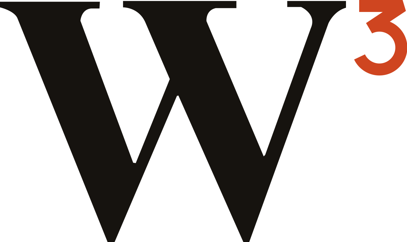
PRIMARY REVERSED
 MONOCHROME
 ON ACCENT
100%
MARK COVERAGE
35 sections shipped
6 detail pages
0 open
03A01The mark
The mark · A01
One letter,
raised to three.
raised to three.
The complete anatomy of the WCN mark — the letterform, the exponent, the proportion, the colour, and what every part of it means.
01
The W
A high-contrast serif W — weight and authority, the lineage of EB Garamond.
02
The ³ exponent
Superscript three, set at ~45% of the W, top-aligned — the “cubed” that reads as Web³.
03
The vermilion accent
Only the ³ is coloured — the accent carries the meaning, never decoration.
A1.1 · CONCEPT
The web, cubed.
One glyph names the category and states the ambition. W³ is read three ways at once — and all of them are true.
READINGW³ → Web³ → Web3
PUNExponent = cubed = compounding
FORMA wordmark, read — not a symbol, decoded
Web3
Web3
 HIGH CONTRAST
BRACKETED SERIF
HIGH CONTRAST
BRACKETED SERIF
A1.2 · THE LETTERFORM
A serif with authority.
A high-contrast serif W in the EB Garamond lineage — the language of publishing houses and institutions, not crypto startups.
FAMILYEB Garamond · weight 600
CONTRASTHigh — thick/thin stress
TERMINALSBracketed serifs · sharp apex
TONETrusted · printed · institutional
A1.3 · THE EXPONENT
The three that
does the work.
does the work.
Small, raised, and the only coloured element — the exponent is where the whole idea lives.
SIZE~45% of cap height
POSITIONSuperscript · top-aligned to cap
WHY 3Web3 · cubed · compounding
COLOURVermilion — the only accent
 1u CLEAR
A1.4 · PROPORTION
Built on one unit.
The exponent sets the system. Its height is the unit — for clear space, alignment, and minimum size.
UNIT³ height = 1u
CLEAR SPACE1u on all four sides
BASELINEW on baseline · ³ to cap
SPACINGOptical, not metric
A1.5 · COLOUR SPLIT
Only the exponent
is coloured.
is coloured.
Ink carries the letter; vermilion carries the meaning. The accent is a rule, never a decoration.
PRIMARY · INK + VERMILIONALL-INK · FALLBACKREVERSED · ON INKLetter — Ink
#16130F
Accent — Vermilion (³ only)
#CF4520
A1.6 · MEANING
What the mark means.
Three readings, one mark — each true at the same time.
Web3
The category.
Before a single word is read, the mark states what WCN is — a Web3 network. The cube is the 3.
x³
The ambition.
Cubed, not summed. Three forces — nodes, agents, proof — raised on one another. Compounding, not adding.
³
The proof.
Meaning lives in the exponent — and only it is coloured. The vermilion ³ is the evidence layer: earned, not claimed.
“A wordmark you read and trust — not a symbol you have to decode.”
03A02Variations
Variations · A02
One mark,
every surface.
every surface.
The mark changes colour to fit the surface — never its form. One rule governs them all: ink carries the letter, vermilion carries the meaning.
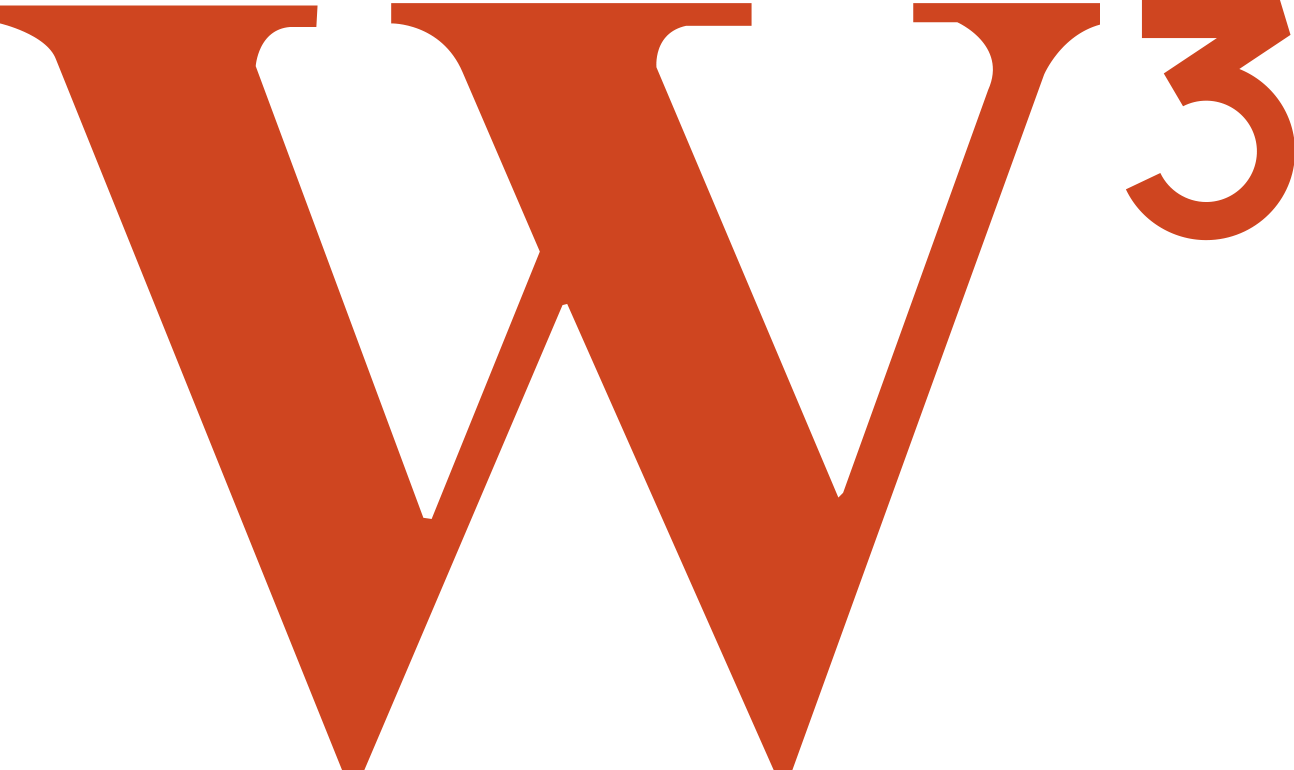
A2.1 · CORE COLOURWAYS
The three that do the work.
Ninety-nine percent of the time, the mark is one of these three. Each keeps the ink-letter / vermilion-exponent split.
A2.1b · TWO SYSTEMS, ONE MARK
Light and dark are a matched pair.
The mark runs as two coordinated systems. The letter flips with the surface — ink on light, paper on dark — while the vermilion ³ never changes. That constant is what makes both read as the same identity.

³
THE CONSTANT · #CF4520
Vermilion is the same in both systems — it is the only colour that never flips. Light or dark, the exponent is always #CF4520.
IF SURFACE IS…
Light & solid
→ Light system, primary. Ink W + vermilion ³.
IF SURFACE IS…
Dark or photographic
→ Dark system, reversed. Paper W + vermilion ³.
IF COLOUR IS…
Unavailable
→ Mono fallback. Letter + exponent one ink, no split.
A2.1c · THE COMPLETE INVENTORY
Three do the work — but seven exist.
The three core states cover almost everything. Four more are sanctioned for the edges: a single-accent stamp, the brand-colour field, and tonal greyscale. Nothing outside these seven is approved.

7.
SANCTIONED STATES
Anything else — recoloured exponent, gradient letter, drop shadow — is misuse. See A2.7.
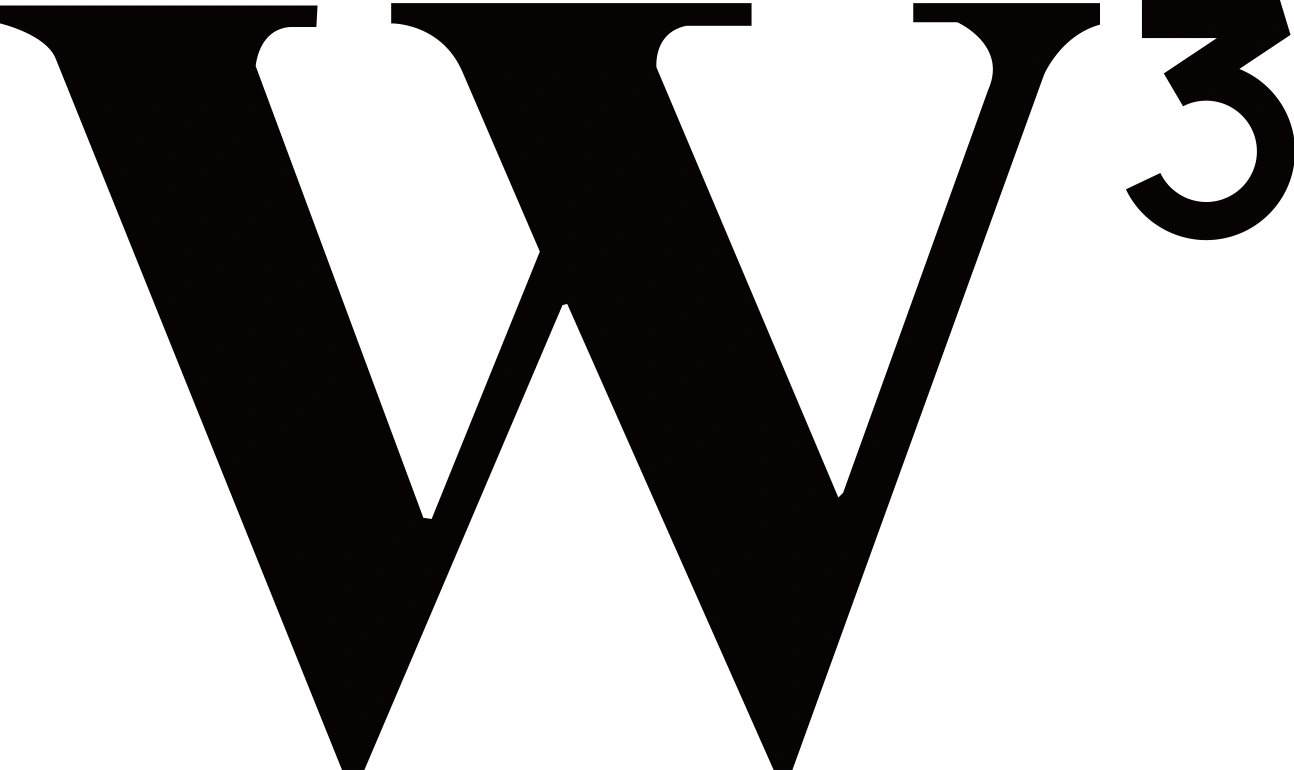
A2.2 · MONO / SINGLE-COLOUR
When only one ink is allowed.
Engraving, embossing, watermarks, one-colour print. The exponent joins the letter — no split, no accent.
SINGLE-COLOUR REPRODUCTION METHODS
MINIMUM STROKE
In mono, the thin serifs are the first to fail. Below the limits, switch to the heavier all-black master and verify the ³ counter stays open.
≥ 0.35 pt
PRINT HAIRLINE
≥ 1.5 px
SCREEN @1×
≥ 8 mm
ENGRAVED

A2.3 · PREMIUM / METALLIC
Gold, for the rare occasion.
A foil-and-emboss treatment for certificates, awards, and special editions. The ³ stays vermilion — gold never touches the meaning.
LETTERGold gradient foil
ACCENTVermilion ³ — unchanged
SURFACEInk or deep tones only — never light cream
REPRODUCING THE GOLD
RESERVED FOR
Certificates & awards
Founding-member editions
Anniversary & milestone pieces
Embossed seals on physical credentials
Founding-member editions
Anniversary & milestone pieces
Embossed seals on physical credentials
NEVER
Everyday collateral & decks
Web & product UI (no real metal)
Social posts & ads
Anything light-cream — gold dies on it
Web & product UI (no real metal)
Social posts & ads
Anything light-cream — gold dies on it
A2.4 · LOCKUPS
Mark, name, and voice.
The mark stands alone, or locks to the WCN wordmark and tagline at fixed proportions.
MARK ONLYWCNHORIZONTALWCNSTACKEDWCN
SOVEREIGN PROOF LEDGER
CLEAR SPACE
Keep a margin equal to the cap-height of the ³ on all four sides. Nothing enters this zone.
MINIMUM SIZE
Mark only16 px / 5 mm
Horizontal88 px / 24 mm
With tagline120 px / 32 mm
Below the minimum, drop to the mark only.
PROPORTIONS
Mark : wordmark height1 : 1.4
Gap (mark → rule)= ½ mark width
Tagline tracking.22em
Lockup proportions are fixed — never re-space by hand.
APPLICATION LOCKUPS
PARTNER
Match cap-heights · divider rule = mark height · clear space ≥ one mark-width between marks.
CO-BRAND
WCN
SOVEREIGN PROOF LEDGER
STACKED + TAGLINE
A2.5 · FORMATS & CONTAINERS
Cropped, framed, contained.
When a surface demands a shape — an app tile, a favicon, an avatar — the mark sits centred in ink with full clear space.
APP ICON
AVATAR
FAVICON · 48 / 32 / 16

SPOT · ON VERMILION
CONTAINER SAFE AREA
Inside any tile the mark sits centred at ~50% of the width, with even padding all round. Corner radius is 22.5% of the side (rounded square) or a full circle for avatars. Background is always ink #16130F — or vermilion for a spot tile.
FILE FORMATS · EXPORT
ScreenRGB · @2x
Vector · primary, any sizew3-vector.svg
Raster · bitmap fallbackw3-master.png
Favicon · tabs & appfavicon.svg
PrintCMYK · PMS
Vector / PDF · master artw3-vector.svg
1-colour · spot K / PMSw3-vector-mono.svg
Reversed · dark stockw3-vector-paper.svg
Vector (SVG) is the master — never rebuild the mark from the raster. Never export below the minimum size, and never re-colour on export.
A2.6 · ON BACKGROUNDS
Which version, where.
The surface decides the variant. Match by contrast — the mark always reads first.
CHOOSE BY CONTRAST
LIGHT · L* ≥ 70 → Primary
VERMILION → Paper mono
DARK · L* ≤ 35 → Reversed / White
Read the background's lightness (L*). Above 70 use the Primary mark; below 35 use Reversed or All-white. The mid-band (35–70) has no safe variant — darken it with a scrim, or don't place the mark there.
On photographs or busy surfaces, lay a 40–60% ink #16130F scrim under the all-white mark so it always clears 4.5:1.
A2.7 · MISUSE
Eight ways to break it.
The form is fixed. These are the only rules you need to remember — each one protects the ink-letter / vermilion-meaning split.
A note on tints
Stone, coral, sand and blue tones exist for data-visualisation only — charts, status, categories. They are never applied to the logo. The mark stays ink, paper, vermilion and gold.
03A03Lockups
Lockups & wordmark · A03
One name,
one lock.
one lock.
The wordmark and its lockups — bound to the mark at fixed proportions. Every measure is relative to the mark, so the lockup scales without ever being re-spaced by hand.
A3.1 · WORDMARK
WCN, set in Garamond.
Three letters, one weight. The wordmark is EB Garamond Medium, all caps — the same serif voice as the W in the mark.
WCN
WORDMARK
SPECIFICATION
TypefaceEB Garamond
WeightMedium · 500
CaseAll caps
Tracking+0.01em
Cap-height= mark height
SAME SERIF W
→
WCN
The wordmark's W is cut from the same high-contrast serif as the mark — the family reads as one voice.
CASE
✓WCNalways all caps
✕Wcnnever title case
✕W.C.N.never punctuated
LETTERFORMS & KERNING
W
−12
C
−6
N
W → CC → N
Three caps, optically spaced — not metrically. The diagonal of the W tucks under the C (−12 units); C to N closes −6. Kerning is baked into the master art; never retype the wordmark live in a layout tool.
WORDMARK COLOURWAYS
The wordmark is monotone by default. The accent-terminal cut (N in #CF4520) echoes the ³ — reserve it for covers and hero moments, never body or UI chrome.
USE THE WORDMARK ALONE WHEN…
✓The mark already appears elsewhere on the same surface
✓In running text, legal lines and footers
✓Where the lockup is too wide for the space
MINIMUM SIZE
WCN
DIGITAL · 22px
WCN
PRINT · 6mm
Below this the serifs fill in — switch to the mark, which holds to 16px.
A3.2 · HORIZONTAL LOCKUP
Mark, rule, name.
The primary lockup: the mark, a hairline rule, then the wordmark — optically centred on one baseline.
 PRIMARY · WITH TAGLINE
WCN
HORIZONTAL · NO TAGLINE
WCN
REVERSED · ON INK
PRIMARY · WITH TAGLINE
WCN
HORIZONTAL · NO TAGLINE
WCN
REVERSED · ON INK
Mark : wordmark 1 : 1.4
Gap ½ mark-width each side of rule
Rule 1px · height = mark · #D6CDBA
ANATOMY
1MARK
2RULE
WCN
SOVEREIGN PROOF LEDGER
Four parts, one piece of art. Mark and wordmark sit on one optical baseline; the rule divides them; the tagline hangs under the wordmark. They are never separated, re-spaced or re-coloured individually.
LOCKUP COLOURWAYS
WITH TAGLINE
✓First impressions — covers, hero, signage, the homepage masthead
✓Anywhere the product is named for the first time
·Needs ≥ 120px width to stay legible
WITHOUT TAGLINE
✓App bars, nav, document headers — repeat, working contexts
✓Tight horizontal bands 88–120px wide
·Default once the brand is established on a surface
A3.3 · STACKED LOCKUP
Stacked, centred.
When width is tight — a card, an avatar, a narrow column — stack the wordmark beneath the mark on one shared centre axis.
WCN
STACKED
WCN
SOVEREIGN PROOF LEDGER
STACKED + TAGLINE
WHEN TO STACK
Horizontal is the default. Switch to stacked only when the lockup must fit a square, an avatar, or a column narrower than ~3× the mark width.
Axis mark + wordmark share one vertical centre
Gap mark → wordmark = ⅓ mark height
Tagline centred under the wordmark
CONSTRUCTION
WCN
GAP = ⅓ mark-height
Shared vertical centre
Mark and wordmark are optically centred on one axis. The wordmark cap-width sits within the mark's footprint — it never overhangs.
STACKED COLOURWAYS
IN CONTAINERS
WCNWCNBUILT FOR SQUARES
App icons, avatars, profile tiles, poster sigs — any near-square frame. Centre the stack; keep the container padding ≥ ¼ of its side. Below 64px, drop to the mark alone.
A3.4 · TAGLINE
With the line.
The tagline is SOVEREIGN PROOF LEDGER — mono, widely tracked. It names the product. It is not the company's legal name.
✓USE IN THE LOCKUP
SOVEREIGN
PROOF LEDGER
PROOF LEDGER
The product tagline. Sits under the wordmark — mono, tracked .22em, stone grey.
✕NEVER IN THE LOCKUP
Web3 Capital
Network
Network
The legal name. Belongs in footers, contracts and first mentions in body copy — never locked to the mark.
TAGLINE SPEC
TypefaceJetBrains Mono
Tracking0.22em
CaseAll caps
ColourStone · #8C8475
WHEN TO DROP IT
Below 120px wide, or in any app-icon / favicon context, omit the tagline and use the wordmark or mark alone — it stops being legible before the mark does.
SETTING · ONE LINE / TWO
WCN
SOVEREIGN PROOF LEDGER
ONE LINE · WIDE
WCN
SOVEREIGN
PROOF LEDGER TWO LINES · NARROW
PROOF LEDGER TWO LINES · NARROW
Gap to wordmark ½ tagline cap-height
Break only after SOVEREIGN — never 3 lines
Alignment centred on the wordmark axis
COLOUR ACROSS BACKGROUNDS
Stone is the default; on dark surfaces lift to light stone so the tagline never drops below 4.5:1, and on vermilion use paper at 90%. The tagline is never set in vermilion itself.
THE NAMING SYSTEM
ELEMENTSET ASWHERE
Product taglineSOVEREIGN PROOF LEDGERLocked under the mark · brand moments
Legal nameWeb3 Capital NetworkFooters, contracts, first mention in body
Short nameWCNEverywhere else after first mention
A3.5 · CONSTRUCTION
Built on the mark.
Every measure is relative to the mark (M) — so the lockup scales to any size without being re-spaced.
½M
½M
WCN
PROPORTIONS
Mark : wordmark height1 : 1.4
Gap (each side of rule)½ M
Rule weight · height1px · = M
Tagline tracking0.22em
CLEAR SPACE
Keep a margin equal to the cap-height of the ³ around the whole lockup — measured from the outermost ink, rule and tagline included. Nothing enters this zone.
THE MODULE
M▲▼
X
MMark height
The full cap-height of the W block. Governs the rule, the gaps and the wordmark — every internal measure is a fraction of M.
X³ cap-height ≈ 0.32 M
The height of the small ³. The single unit for clear space around the whole lockup.
CLEAR SPACE · DRAWN
X
X
WCN
WCN
The exclusion zone is X (the ³ cap-height) on every side, measured from the outermost ink — rule and tagline included. No type, image or partner mark enters the dashed boundary. When in doubt, give it more.
A3.6 · SIZING
Down to the favicon.
Below each threshold, drop a layer — tagline first, then the wordmark — until only the mark remains.
WCN
SOVEREIGN PROOF LEDGER
WCN
≥ 16px · mark
MINIMUM SIZE
With tagline120 px / 32 mm
Horizontal lockup88 px / 24 mm
Stacked lockup64 px / 18 mm
Mark only16 px / 5 mm
DON'T CROWD IT
When shrinking, never thin the rule or tighten the gap to save space — drop a whole layer instead. The proportions never change.
EXPORT SIZES
DIGITALRGB · @2x
Favicon · browser tab16 · 32 · 48 px
Toolbar / nav28 – 32 px
Social avatar180 px
App / store icon512 · 1024 px
PRINTlockup width
Business card14 mm
Letterhead24 mm
Brochure / cover32 mm
Signageno max · X scales
AT SMALL SIZES
 483216
Below 24px, use favicon.svg — never the lockup.
The favicon is a dedicated tile: dark ground, open ³ counter, thickened strokes so the mark survives at 16px. The wordmark and tagline are dropped entirely — they fill in long before this size.
A3.7 · MISUSE
Never re-space the lockup.
The lockup is one fixed piece of artwork. These eight are the ways it breaks.
03A04Construction
Construction · A04
Drawn on a grid.
The geometry behind the mark — its grid, its proportions, the exponent, the clear space and the optical corrections that make it sit right at any size.
A4.1 · THE GRID
Built on a unit grid.
The mark is drawn on a square unit grid. The cap-height of the W is the base measure; every other part is a fraction of it.
The W sits between cap-line and baseline; the ³ occupies a band of height X (0.32 cap) below the cap-line. Curves overshoot both lines slightly — see A4.6.
Cap line top of the W
Baseline foot of the W
X ³ cap-height = 0.32 cap · the clear-space unit
BASE UNIT
1 = cap-height
The W cap-height. All measures are fractions of it.
BOUNDING BOX
1.68 : 1
Mark width : height, exponent included.
REBUILD
Never
The grid explains the art — it isn't a redraw recipe. Use the master vector.
GEOMETRIC ENVELOPE
1.68 W
1.00
H
H
ONE MODULE, WHOLE SYSTEM
The mark locks to a 1.68 : 1 envelope — width to height, exponent included. Hold the ratio when scaling; never stretch one axis. The same cap-height module sets the wordmark in A3 and the body baseline, so mark, logotype and copy share one rhythm.
A4.2 · PROPORTIONS
High contrast.
The mark is a high-contrast serif W — thick diagonals, hairline verticals — with the exponent set at roughly a third of the cap-height.
10
KEY RATIOS
W cap-height1.00
³ cap-height0.32
Stroke contrast≈ 4 : 1
Mark W : H1.68 : 1
Overshoot≈ 1.5%
STROKE CONTRAST · ≈ 4 : 1
THICK
THIN
The thick diagonals are roughly four times the weight of the hairline verticals and serifs — the signature of a high-contrast serif.
THICKS CARRY THE WEIGHT
Voice high-contrast serif — capital, financial
Thicks the W diagonals carry the weight
Thins verticals and serifs stay hairline
A4.3 · THE EXPONENT ³
Web, cubed.
The ³ is the idea of the mark — Web³. It is a true superscript: set on the W's cap-line, sized at a third of the cap-height, and the one element rendered in vermilion.
EXPONENT SPEC
PositionTop-right
Baseline= W cap-line
Size0.32 cap
ColourVermilion #CF4520
Optical gaptuned, not metric
WHY A 3
W to the power of 3 — the third era of the web. The exponent turns a letter into a statement: this is Web³, not just a W.
THE ONE ACCENT
The ³ is the only part that ever carries colour — vermilion in every full-colour cut, on light and dark. It drops to the single ink only in monochrome, or to all-white where red can't hold (on vermilion, on photos).
³ ACROSS CUTS
EXPONENT INTEGRITY
✕Detach the ³
The exponent never floats free of the W — they are one glyph, one piece of art.
✕Resize the ³
Its 0.32 ratio is fixed. Never scale the exponent on its own to make it louder or quieter.
✕Recolour the ³
Vermilion in full-colour, or the single ink in mono — never any other hue.
A4.4 · CLEAR SPACE
Room to breathe.
The bare mark keeps an exclusion zone of X — the ³ cap-height — on every side. Nothing crosses it.
X
X
X
X
X = the cap-height of the ³, measured from the outermost ink. Type, imagery and partner marks all stay outside the dashed boundary. Clear space scales with the mark — always a multiple of X, never a fixed pixel value. When unsure, give it more.
RESPECT THE ZONE
From trim / screen edge ≥ X
From body text ≥ X
From another logo ≥ 2X
A4.5 · MINIMUM SIZE
Holds to 16px.
The bare mark stays legible down to 16px on screen and 5mm in print. Below that, switch to the favicon tile.
64
32
24
16 · MIN
↓ FAVICON
MARK MINIMUMS
Screen16 px
Print5 mm
Below 16pxuse favicon.svg
WHY IT HOLDS
At 16px the thin verticals are still 1px and the ³ counter stays open. Go smaller and they fill in — the favicon tile is redrawn with heavier strokes for exactly this range.
THE FAVICON HANDOFF
BARE MARK · 16 / 12
Thin strokes — weak as a tiny target
FAVICON · 16 / 12
Dark tile + heavier strokes — strong target
✓ Measure the minimum by mark height
✕ Add a keyline to rescue a too-small mark
✕ Shrink the lockup or wordmark to icon size
A4.6 · OPTICAL ADJUSTMENTS
Right beats measured.
Geometry alone looks wrong. Four corrections are baked into the master so the mark reads as balanced — never undo them.
These corrections live in the vector master. Rebuilding the mark on a strict grid would undo them and make it look subtly off — always place the supplied artwork.
03A05Application
Application · A05
Into the world.
Where the mark goes once it leaves the grid — background pairings, the icon system, co-branding, placement in a layout, and the identity at work in real surfaces.
A5.1 · ON BACKGROUNDS
The right cut, every ground.
Four approved pairings. Read the background's lightness, then pick the cut that clears 4.5:1 — full decision logic lives in A2.6.
SAFE GROUNDS
Paper, ink, vermilion and the deep brand tones. On busy or mid-value surfaces, drop a 40–60% ink scrim under the all-white cut.
NEVER
The primary cut on a mid-tone, the red ³ on vermilion, or any cut on a clashing brand colour. When unsure, reverse on ink.
AVOID
A5.2 · APP ICON & FAVICON
One tile, every platform.
The icon is a fixed tile: ink ground, paper W, vermilion ³. One master scales from the 16px favicon to the 1024px store icon.
MASTER ICON · favicon.svg
1024 · STORE
512 · PWA
180 · TOUCH
48
16
SAFE AREA
Mark ≤ 80% · maskable
MASKABLE
Survives round & squircle crops
MONO TAB
Safari pinned · single ink
IN THE WILD
EXPORT CHECKLIST
FILESIZE / FORMAT
favicon.ico · browser tab16 · 32 · 48
apple-touch-icon.png · iOS home180
icon-192 / 512.png · Android · PWA maskable192 · 512
safari-pinned-tab.svg · single inkmono SVG
icon-1024.png · App Store1024
manifest theme-color · address bar / splash#16130F
A5.3 · CO-BRANDING
Side by side.
When WCN appears with a partner, a divider rule keeps the two marks equal and apart. Match cap-heights, never crowd.
PARTNER
RELATIONSHIP MODELS
IN PARTNERSHIP WITH
PARTNER
BACKED BY
WCN
WCN
BACKED BY
WCN
PORTFOLIO SIGNATURE
WCN
DIVIDER
1px rule, height = mark, stone #D6CDBA. Always vertical, optically centred.
SPACING
Gap each side of the rule ≥ one mark-width. Clear space rules still apply to both marks.
HIERARCHY
Host brand leads, left. Match cap-heights — never scale one mark to dominate.
✓Always: give both marks equal cap-height, equal visual weight and full clear space.
✕Never: lock the partner mark inside WCN clear space or recolour it.
A5.4 · PLACEMENT & ALIGNMENT
Anchored to the margin.
In a layout the mark sits in a corner, set off the edge by its clear space, aligned to the page grid — not floated in the middle.
TOP-LEFT · STANDARD
Default home: top-left, one clear-space unit off both edges, locked to the content margin.
CENTRED · ENDORSEMENT
Centre only on covers, splash and sign-off frames — where the mark is the sole subject.
PERMITTED CORNERS
DEFAULT
Top-left is home. Top-right, bottom-left and bottom-right are permitted when the layout calls for it — always one clear-space unit (X) off both edges.
Offset = clear space (X) from every edge
Align to the layout's column & baseline grid
Scale mark height ≈ 1× the body cap-height in headers
AVOID
A5.5 · IN CONTEXT
At work.
The identity applied across print, screen, environment and merch. One mark, one voice, every surface.
SURFACES
WCNA. Mercer
Capital Partner
WCN.NETWORK
02 · THESIS
The third era
is sovereign.
is sovereign.
WCN✓
@wcn_network
Web3 Capital Network — sovereign proof ledger.
STATIONERY · ENVIRONMENT · MERCH
WCNWCN.NETWORK
WCN
LOBBY SIGNAGE
SOCIAL FORMATS
Sovereign capital, on-chain.
Web3 Capital Network
APPLY
Every format ships as a template — the mark anchors a corner, the headline sits in EB Garamond, the CTA in vermilion. Compose to the frame; never stretch one layout to another ratio.
APPAREL · VEHICLE · PACKAGING
WCN
STICKER · BADGE · MUG · BOOTH
WCNTICKET · ACCESS · AD · EMAIL
EVENT TICKET
ACCESS PASS
AD
DISPLAY AD · 300×250
Own the
third era.
INVEST →
third era.
Alex Mercer
Capital Partner
WCN.NETWORK
alex@wcn.network
03A06Rules & assets
Rules & assets · A06
Hold the line.
The chapter that protects the work — what never to do to the mark, which file to reach for, the master assets to ship, and how the mark moves. The last mile of a world-class identity.
A6.1 · MISUSE
Eight ways to break it.
One mark, drawn one way. Every example below is forbidden — recolouring, distorting, rotating, decorating, fading, or dropping it onto art that swallows it. When in doubt, reach for an approved lockup from A6.3 instead of improvising.
THE ONE RULE
If a surface kills the vermilion ³ or the ink W, switch to an approved single-colour version — paper, mono, or all-white — rather than altering the mark.
A6.2 · FILE FORMATS
Reach for the right one.
Two formats, five colour cuts. SVG is the default everywhere it is supported; PNG is the raster fallback. The colour variant is decided by the surface, never by taste.
COLOUR VARIANTS — DECIDED BY SURFACE
COLOUR SPACE & PROFILES — BUILD VALUES
Screen builds use HEX / RGB; offset & large-format print use CMYK; spot and merchandise use the Pantone reference. Match the build to the medium — never eyeball a conversion.
BEYOND SVG & PNG — PRINT & LEGACY
PDFVECTOR
Vector handoff for print vendors and decks. Embeds CMYK + fonts.
EPSLEGACY
For sign shops & large-format rigs that still require EPS.
ICORASTER
Multi-resolution Windows favicon — 16 / 32 / 48 px bundled.
WebPWEB
Compressed raster for the web when a smaller file than PNG matters.
FILE NAMING — ONE PATTERN, NO GUESSING
EXAMPLES
wcn-mark_full_rgb.svg
wcn-mark_paper_rgb.svg
wcn-mark_mono.svg
wcn-mark_full_cmyk.pdf
wcn-lockup_white_rgb.svg
wcn-favicon_512.png
✓ lowercase only
✓ hyphen in words · underscore between tokens
✕ no spaces
✕ no version numbers in shipped files
EXPORT SIZES — RASTER LADDER
ASSETSIZES (px)USE
favicon.ico16 · 32 · 48Browser tab — multi-res bundle
apple-touch-icon180 × 180iOS home-screen tile
PWA / maskable192 · 512Installable web app icons
mark PNG @1/2/3×64 · 128 · 192Email & raster-only placements
social avatar400 · 1000Profile pictures across platforms
OG / share card1200 × 630Link previews & social sharing
Every raster is exported from the vector master at exact even pixels — never up-scaled. Maskable icons keep the mark inside the 80% safe zone so platform masks never clip it.
A6.3 · VECTOR MASTER & ASSET PACK
One master, every derivative.
The mark is drawn once, as a vector, on the construction grid. Every colour cut, raster, favicon, and lockup is exported from it — never redrawn by hand. This is the single source of truth.
MASTER · w3-vector.svg
Built on the grid. Exported everywhere.
Outlined paths, no live text, optical corrections baked in. Keep the editable source in the brand vault; distribute only the locked exports below.
MASTER · TECHNICAL SPEC
ARTBOARD · VIEWBOX
0 0 1294 770
Fixed master canvas — every export scales from this.
GEOMETRY
Outlined paths
No live text or fonts — pure vector, renders identically anywhere.
FILL RULE
evenodd
Counter inside the W³ stays open at every size.
PRECISION
0.5px decimals
Tight coordinates — accurate, not bloated.
OPTICAL
Corrections baked
Overshoot, centring & stroke comp built into the paths.
FOOTPRINT
~2.8 KB
One compound path — minified, optimiser-clean.
ASSET PACK · WHAT SHIPS
FILEFORMATUSE
w3-vector.svgw3-vector-paper.svgw3-vector-mono.svgw3-vector-allwhite.svgfavicon.svgw3-lockup.svg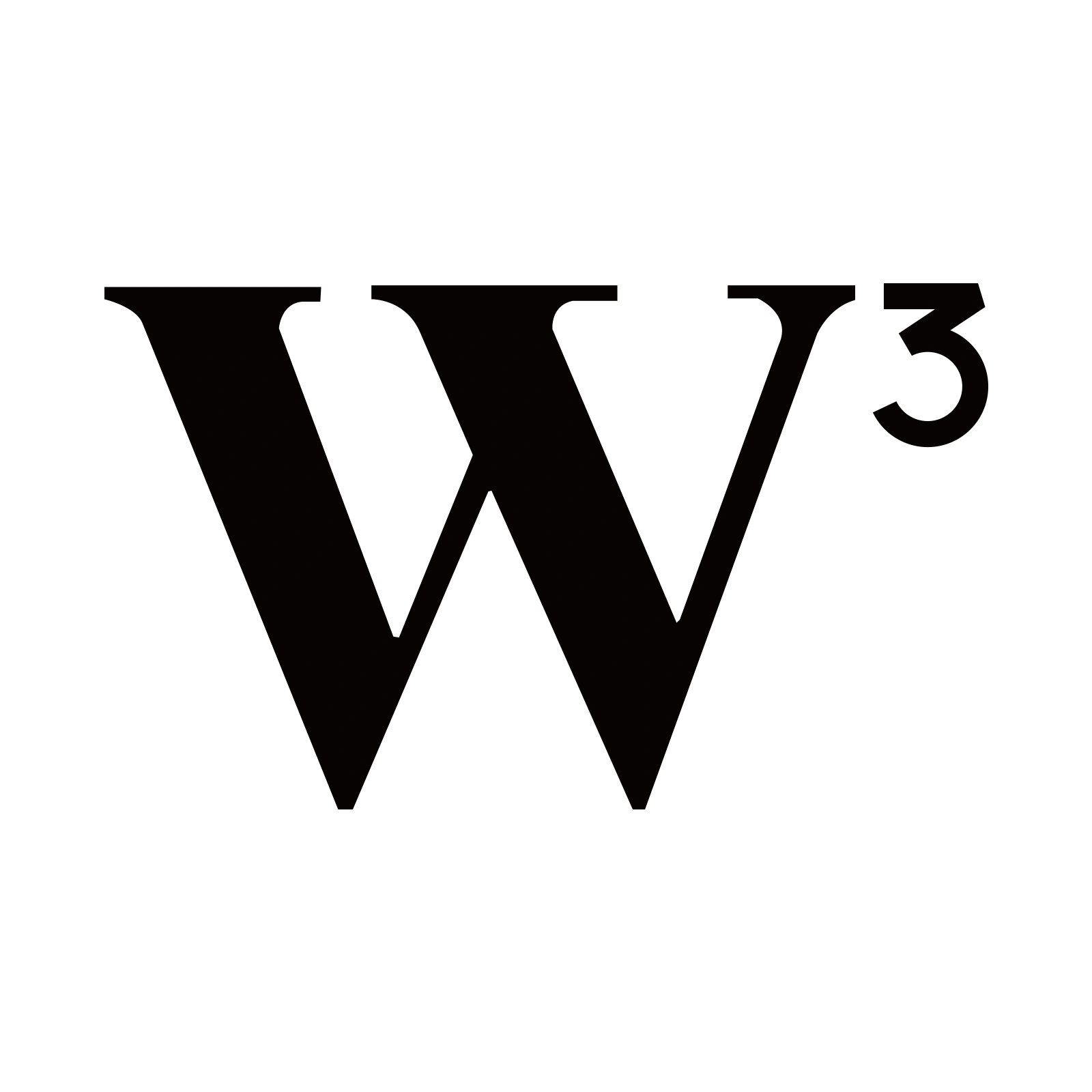 w3-mark.png
PACK STRUCTURE · WHAT'S IN THE ZIP
VERSION & GOVERNANCE
VERSIONv1.0
OWNERBrand · WCN
SOURCEBrand vault
REQUESTbrand@wcn.network
The editable master never leaves the vault — only locked, versioned exports ship. Single source of truth; no hand-redrawing.
INTEGRITY · BEFORE A NEW EXPORT SHIPS
✓ exported from master only
✓ even-pixel raster
✓ run through SVG optimiser
✓ passes min-size test
✓ named to convention
✕ never redrawn by hand
A6.4 · MOTION
How the mark moves.
The mark animates in three sanctioned ways — a reveal, a loader, and a live pulse. Motion is calm and brief; the glyph itself never rotates or distorts. Everything respects reduced-motion.
REVEAL · splash & intro
DURATION
320–480ms
EASING
(.2,.7,.2,1)
NEVER
Rotate or distort the glyph itself.
ALWAYS
Honour prefers-reduced-motion.
MOTION PRINCIPLES — THE CHARACTER
Calm
Eased and assured — never bouncy, springy, or playful.
Brief
In and gone. Motion serves the moment, it never performs.
Whole
The mark moves as one body — the ³ never animates alone.
Respectful
Always a reduced-motion fallback — accessibility first.
THE REVEAL — FRAME BY FRAME
Opacity and a short upward travel only — no scale, no rotation. The mark rises into place and holds. This is the single signature reveal across splash, first paint, and hero.
TIMING & EASING — TOKENS
TOKENDURATIONCURVEUSE
motion-reveal480ms(.2,.7,.2,1)Splash & first paint
motion-enter320ms(.2,.7,.2,1)UI entrances
motion-exit200ms(.4,0,1,1)Dismissals & exits
motion-loader1s · looplinearProcessing & async waits
motion-pulse2s · loopease-outLive / active states
Demos above loop slowly for preview; production timings are the tokens here. Entrances ease-out, exits ease-in — energy enters gently and leaves quickly.
DO
✓Ease in and out — calm, confident timing
✓Keep it brief — under half a second
✓Move the mark as one whole body
✓Fade opacity & travel for entrances
✓Ship a reduced-motion fallback
DON'T
✕Rotate or spin the glyph itself
✕Stretch, squash, or distort the form
✕Bounce or overshoot on settle
✕Strobe, flash, or flicker
✕Animate the ³ separately from the W
REDUCED MOTION — THE FALLBACK
When the user asks for less, the mark simply appears.
Under prefers-reduced-motion: reduce, all travel, looping, and pulsing are dropped. The reveal becomes an opacity-only fade ≤200ms; the loader becomes a static state. No transforms, ever.
A · Logo & mark — complete
Six chapters, one mark, fully protected.
Meaning, construction, variations, anatomy, application, and now the rules that keep it intact. The W³ identity is documented end to end — ready to ship anywhere in the world.
Chapter complete
The strongest cluster in the system.
A1–A6 are documented end to end — meaning, construction, variations, anatomy, application, and the rules, assets & motion that protect the mark.
WCN Logo & Mark Map · 6 clusters · 35 sections · A1–A603 · VISUAL · A · v5.0